
Map in R
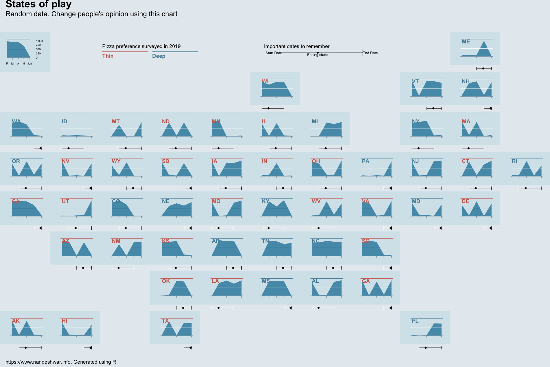
In this article, you will learn how to create a really cool data visualization that appeared in the Economist. This chart looks like a map, but instead of your typical filled in maps a.k.a. choropleths, you see an area plot where a state should be. This chart gives you a lot of information in a small space. For example, you can see the changes in the number of cases by time. You can see the result of 2016 presidential election. And, you also see a legend to see the dates when key decisions were made.

I wanted to see whether I could re-create this chart in R. In this video, you will learn about those steps. And the great thing is about this script is you can modify it to create any map type of a plot. We could use fewer choropleths.

Let’s get started.
First, let’s load the libraries.
library(dplyr)
library(ggplot2)
library(tidyverse)
library(ggthemes)
library(scales)
library(lubridate)
library(readxl)Code language: R (r)Then, load an Excel file containing the location of each of the states in an 8 X 11 grid with one square per state.
state_loc_temp_file <- tempfile()
download.file("https://www.dropbox.com/s/flwu7ahky9lhlji/us-states-grid-number.xlsx?raw=1", state_loc_temp_file)

state_loc <- read_excel(path = state_loc_temp_file, col_names = TRUE, range = "A1:B51")
unlink(state_loc_temp_file)
head(state_loc)Code language: R (r)
## # A tibble: 6 x 2
## state boxnumber
##
## 1 AL 73
## 2 AK 78
## 3 AZ 57
## 4 AR 60
## 5 CA 45
## 6 CO 47 Then, let's generate some fake data for each of the states. The data frame contains a metric for each state for months from February to June. One metric per month per state.
imp_data_df <- data.frame(state = rep(state.abb, 5),
                          stat_date = rep(seq.Date(from = as.Date("2020-02-01"),
                                                   to = as.Date("2020-06-01"),
                                                   by = "month"),
                                          each = 50),
                          stat = rnorm(250, mean = 1000, sd = 150)) %>%
  mutate(stat = ifelse(stat > 1000 | stat < 0,
                       sample(runif(100), n(), replace = TRUE) * 100,
                       stat))

head(imp_data_df)Code language: R (r)
## state stat_date stat
## 1 AL 2020-02-01 782.01548
## 2 AK 2020-02-01 925.37455
## 3 AZ 2020-02-01 937.37239
## 4 AR 2020-02-01 73.23171
## 5 CA 2020-02-01 968.69072
## 6 CO 2020-02-01 59.34878One feature of this chart is the legend below the chart that shows the changes in the metric with some key dates. Therefore, I generated a data frame with start dates, end dates, and a key decision date. Once a start date for each of the state was generated, I added some random days to get an end date as well as a key decision date.
decision_dates_df <- data.frame(
  state = state.abb,
  start_dt = sample(
    x = as.Date("2020-02-01") + months(0:2),
    size = 50,
    replace = TRUE
  )
)

decision_dates_df <-  mutate(decision_dates_df,
    end_dt = start_dt + months(sample(2:4, size = 1)),
    end_dt = if_else(end_dt > as.Date("2020-06-01"), as.Date("2020-06-01"), end_dt),
    easing_dt = start_dt + days(sample(
      20:40,
      size = 1, replace = TRUE
    ))
  )

head(decision_dates_df)
Code language: R (r)
## state start_dt end_dt easing_dt
## 1 AL 2020-03-01 2020-06-01 2020-04-03
## 2 AK 2020-03-01 2020-06-01 2020-04-03
## 3 AZ 2020-03-01 2020-06-01 2020-04-03
## 4 AR 2020-03-01 2020-06-01 2020-04-03
## 5 CA 2020-03-01 2020-06-01 2020-04-03
## 6 CO 2020-02-01 2020-06-01 2020-03-05Then, let's create a tibble to randomly assign the highlight colors for each of the states. I joined this table with the state locations we imported in the beginning.
plots_tbl <- tibble(
  state = state.abb,
  highlight_color = sample(c("#cd6b61", "#578ca4"),
    size = 50,
    replace = TRUE
  )
)

head(plots_tbl)

plots_tbl <- left_join(plots_tbl, state_loc)Code language: R (r)
## # A tibble: 6 x 2
## state highlight_color
##
## 1 AL #cd6b61
## 2 AK #cd6b61
## 3 AZ #cd6b61
## 4 AR #cd6b61
## 5 CA #578ca4
## 6 CO #578ca4 Let’s create a function to create the range bar based on these dates. This chart is dot plot or a point to show the easing date and a segment plot to create a line between start date and end date. Then I plot the two vertical lines at the end using segment annotations.
rangebar_plot <- function(df, xaxis_st_dt = as.Date("2020-02-01"), xaxis_end_dt = as.Date("2020-06-01")) {
    p <- ggplot(df, aes(x = easing_dt, y = 1)) +
      geom_point(size = 0.1) +
      scale_x_date(
        limits = c(xaxis_st_dt, xaxis_end_dt),
        date_breaks = "1 month"
      )

    p <- p + geom_segment(
        data = df,
        aes(x = start_dt,
            xend = end_dt,
            y = 1,
            yend = 1),
        size = 0.1) +
      scale_y_continuous(limits = c(0.98, 1.02), expand = c(0, 0))

    segment_st_pos <- 0.99

    p <- p + annotate(
        "segment",
        x = df$start_dt,
        xend = df$start_dt,
        y = segment_st_pos,
        yend = segment_st_pos + .02,
        size = 0.1
      ) +
      annotate(
        "segment",
        x = df$end_dt,
        xend = df$end_dt,
        y = segment_st_pos,
        yend = segment_st_pos + .02,
        size = 0.1
      )

    p <- p + theme_void()

    p
  }

rangebar_plot(filter(decision_dates_df, state == 'CA'))
Code language: R (r)
Next, let's create a function to create an area graph which will also show the state name and a line with the highlight colors of our choosing as seen in the Economist article for the 2016 presidential election results.
state_plot <- function(df,
                       highlight_color = "blue",
                       xaxis_st_dt = as.Date("2020-02-01"),
                       xaxis_end_dt = as.Date("2020-06-01")) {
    g <- ggplot(df, aes(x = stat_date, y = stat)) +
      geom_area(fill = "#559ab7") +
      scale_y_continuous(limits = c(0, 1100), expand = c(0, 0)) +
      scale_x_date(limits = c(xaxis_st_dt, xaxis_end_dt),
                   date_breaks = "1 month")

    g <- g +
      annotate(
        "text",
        x = as.Date("2020-02-01"),
        y = 1070,
        label = unique(df$state),
        size = 1.5,
        color = highlight_color,
        hjust = 0,
        vjust = 1,
        fontface = "bold"
      )

    g <- g +
      geom_hline(yintercept = Inf,
                 size = 0.3,
                 color = highlight_color)

    g <- g +
      theme(
        axis.ticks.length.x = unit(1.3, "points"),
        axis.ticks.x = element_line(color = "#8aa6b6", size = 0.2),
        axis.line.x = element_line(color = "#8aa6b6", size = 0.2),
        axis.text = element_blank(),
        axis.title = element_blank(),
        panel.background = element_rect(fill = "#d5e4eb", linetype = 0),
        panel.border = element_blank(),
        plot.background = element_rect(fill = "#d5e4eb",
                                       color = NA),
        panel.grid = element_blank(),
        axis.ticks.y = element_blank()
      )

    g <- g + geom_hline(yintercept = 500,
                        size = 0.1,
                        color = "white")
    return(g)
  }

state_plot(filter(imp_data_df, state == "CA"))
Code language: R (r)
Next, rather than plotting everything, we actually store the plots in the tibble we created earlier. This way, we still retain each state, its location in the grid and the associated plot in a tiblle that we can manipulate.
We use the map2 function to iterate over the state and the highlight color to create the area plot, the error bar plot, and put them into a plot using the plot_grids function from the cowplot package. We could have used a loop here, but mutate and map2 let us create a variable to store the ggplot object.
plots_tbl <- mutate(plots_tbl,
                    plots = map2(.x = state, .y = highlight_color,
                                 .f = function(x, y) {
                                   st_plt <- state_plot(filter(imp_data_df, state == x),
                                                        highlight_color = y)
                                   rng_plt <- rangebar_plot(filter(decision_dates_df, state == x))
                                   cowplot::plot_grid(st_plt, rng_plt, nrow = 2,
                                                      labels = NULL,
                                                      align = "v",
                                                      axis = "t",
                                                      rel_heights = c(5, 1))
                                   }
                                 ))

head(plots_tbl)
Code language: R (r)
## # A tibble: 6 x 4
## state highlight_color boxnumber plots
##
## 1 AL #cd6b61 73
## 2 AK #cd6b61 78
## 3 AZ #cd6b61 57
## 4 AR #cd6b61 60
## 5 CA #578ca4 45
## 6 CO #578ca4 47
Next, let’s create the legend plot that’s explains the area plot. Since it has additional information, we can’t use the previous function and we need to create a separate plot.
lp <- ggplot(filter(imp_data_df, state == "CA"), aes(x = stat_date, y = stat))
lp <- lp + geom_area(fill = "#559ab7") +
  scale_y_continuous(limits = c(0, 1100), expand = c(0, 0), labels = comma, position = "right") +
  scale_x_date(breaks = as.Date("2020-06-01") - months(0:4),
               labels = rev(c("F", "M", "A", "M", "Jun")),
               expand = c(0, 0))
lp <- lp + geom_hline(yintercept = Inf, size = 0.3, color = '#578ca4')

lp <- lp + theme(axis.ticks.length.x = unit(1.5, "points"),
                 axis.ticks.x = element_line(color = "#8aa6b6", size = 0.2),
                 axis.line.x = element_line(color = "#8aa6b6", size = 0.2),
                 axis.text = element_text(color = "black", size = 2.2),
                 axis.title = element_blank(),
                 panel.background = element_rect(fill = "#d5e4eb", linetype = 0),
                 panel.border = element_blank(),
                 plot.background = element_rect(
                   fill = "#d5e4eb",
                   colour = NA
                   ),
                 panel.grid = element_blank(),
                 axis.ticks.y = element_blank())

lp <- lp + geom_hline(yintercept = 500, size = 0.1, color = "white")

lp
Code language: R (r)
Next, let’s create the legend plot for the highlight color. In this case, we are creating a legend plot for pizza preference.
pizza_pref <- data.frame(y = 1,
                         x = 0,
                         label = c("Thin", "Deep"),
                         color = c('#cd6b61', '#578ca4'),
                         stringsAsFactors = FALSE)

pizza_pref_plot_fn <- function(what_type) {
  df <- filter(pizza_pref, label == what_type)
  label_color <- df$color

  g <- ggplot(data = df,
              aes(x = x, y = y, label = label, color = label)) +
    geom_segment(aes(xend = 1, yend = y), size = 0.3)
  g <- g + geom_text(size = 1.5, color = label_color,
                     hjust = 0,
                     vjust = 1.5,
                     fontface = "bold")
  g <- g + scale_color_manual(values = label_color) +
    theme_void() +
    theme(legend.position = "none")

  g
}

pizza_pref_plot_fn(what_type = "Deep")
Code language: R (r)
We need to create another legend for the error bar type of a plot, which shows the start, end and the easing dates.
range_bar_legend_plt <- filter(decision_dates_df, state == 'WY') %>% {
  rangebar_plot(df = .) +
    scale_x_date(limits = c(as.Date("2020-02-01"), as.Date("2020-07-01")), date_breaks = "1 month") +
    annotate("text", x = .$start_dt, label = "Start Date", y = 1, hjust = 1, size = 1) +
    annotate("text", x = .$end_dt, label = "End Date", y = 1, hjust = 0, size = 1)  +
    annotate("text", x = .$easing_dt, label = "Easing starts", y = 1, vjust = 1.2, size = 1)
}

range_bar_legend_plt
Code language: R (r)
Final Touches
We’re getting to the final finishing touches now.
Let’s create an empty vector for the 8 X 11 grid cells.
my_list <- rep(NA, 88)Code language: R (r)Then, in this vector let’s store the plots in their respective locations.
Code language: R (r)my_list[plots_tbl$boxnumber] <- plots_tbl$plots
Place the legend in the first box.
my_list[[1]] <- lpCode language: R (r)And then the preference legends in the third and fourth box.
my_list[[3]] <- pizza_pref_plot_fn(what_type = "Thin")
my_list[[4]] <- pizza_pref_plot_fn(what_type = "Deep")Code language: R (r)
Now, as a final step, place all the subplots in a grid using the plot_grid function from cowplot.
gridded_plots <- cowplot::plot_grid(plotlist = my_list, nrow = 8, ncol = 11)
gridded_plotsCode language: R (r)
Finally, let’s add title, subtitle and captions.
title_pos <- 0.01


final_plot <- cowplot::ggdraw(gridded_plots, ylim = c(-0.05, 1.1)) +
  cowplot:: draw_plot(range_bar_legend_plt, x = .35, y = .915, width = .4, height = 0.04) +
  cowplot::draw_label("Important dates to remember", x = .48, y = 0.95,  hjust = 0, vjust = 0, size = 4) +
  cowplot::draw_label("States of play", x = title_pos, y = 1.1,  hjust = 0, vjust = 1, size = 8, fontface = "bold") +
  cowplot::draw_label("Random data. Change people's opinion using this chart", x = title_pos, y = 1.065,  hjust = 0, vjust = 1, size = 5.5) +
  cowplot::draw_label("https://www.nandeshwar.info. Generated using R", x = title_pos, y = -0.05,  hjust = 0, vjust = -1, size = 4) +
  cowplot::draw_label("Pizza preference surveyed in 2019", x = .186, y = 0.95,  hjust = 0, vjust = 0, size = 4)

Code language: R (r)
And save it using the ggsave function! And done!
ggsave(plot = final_plot,
       filename = "my_us_map_plot.png",
       width = 6,
       height = 4,
       bg = "#E5EBF0") # changing the whole background color
Code language: R (r)
Compare it with the original plot. Pretty close! I am happy with these results, because now this script can be used for other data sets and additional graphic design would be minimal.
There you have it! A map-like plot with an individual area plot for each state, along with some additional details for each of the plots, legends and other keys.
Let me know what you think. And also, if anything is unclear, please let me know.
[…] data visualization book list will remain incomplete if missing Tufte's books. Edward Tufte, with his beautiful design […]